Your Onboarding Might be Killing your Business

A couple of weeks ago, I saw this screenshot below, and I thought to myself how much I could relate to this I literally clicked it for anything.
The onboarding screen is one of the first things we learn to design. Most people think it’s just the login screen with an email and password field and a couple of authentication options, such as Google or Apple. It's important to note that this is probably the first point of contact your users have with your product, and as such, it's got to be great.
A Study by Wyzowl showed that Over 90% of customers feel that the companies they buy from ‘could do better’ when it comes to onboarding new users/customers.
That's such a crazy number, and although processes like this have become more refined over the years, we can’t help but continually talk about it. It's interesting to note that if you ever worked on a product, the onboarding can either one way: it either refined so much till we’re not entirely sure what it is anymore, or there isn't a lot of thought into it, so parts are put together that don't necessarily fit the product requirements.
As Product designers, we understand that the experience and interface have to be *chefs kiss* but essentially, the business implication of what we build and how a drop-off from the first screen can cause a massive loss of users, which in turn affects the business.
So, how do we tie the Interface, Experience, and Business together to solve this problem?
To address this, we need to tightly align the interface, user experience, and business. I’ll be showing how these problems interconnect and a way we can solve them.
UI [User Interface]: this is essentially the first touch point for your product, if it's confusing, it can directly harm engagement and retention.
A couple of ways we can stop this is by
- Simplify Key Actions: As a Product designer, you’d want to Prioritize core features, for example, Slack’s onboarding focuses on guiding users to invite teammates and send messages quickly. This led to a 10% increase in activation rates, contributing to $1M in annual recurring revenue (ARR) within a year.
- Visual hierarchy: this is so important in design, the way we use colors, contrast, and spacing to guide users cannot be over-emphasized
- Ensure responsiveness: It's believed that 85% of users prefer mobile apps with intuitive onboarding and that a large percentage of customers you would be missing out if responsive design isn’t considered.
Business Impact:
- HubSpot’s simplified UI reduced onboarding steps, driving a 15% increase in conversions (≈$1.2M ARR lift for SMBs).
- Cost of failure: Confusing UI → wasted engineering time on redesigns + lost user trust.
UX [User Experience]: A disjointed journey could erode satisfaction and loyalty to your product. A study from Bain & Company claims that users who don’t see value in the first session have 3x higher churn.
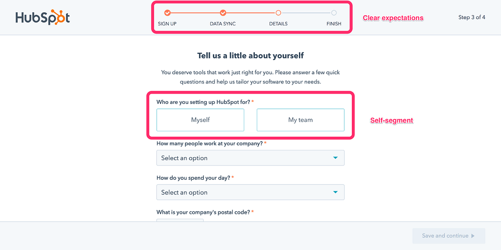
We want to personalize flows as much as possible, depending on the kind of product you are building, you can move towards a role-based onboarding (e.g., Salesforce tailors its dashboard for HR vs. IT teams).
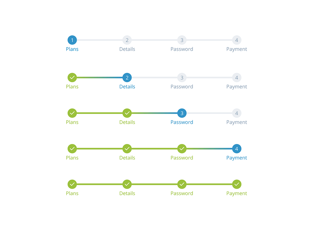
Progress bars have also helped to give a feel or reward boost while onboarding. Asana’s task completion is one example of this, and it also helped raise engagement by 40%
Business Impact:
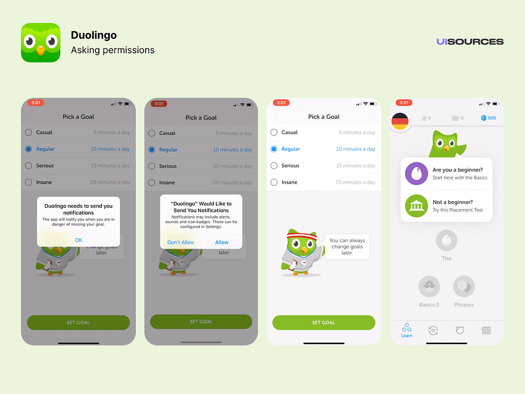
- Example: Duolingo’s interactive onboarding drove 20% higher Day 7 retention, translating to $200M+ annual revenue.
- Cost of failure: Poor UX → $1.6M/year in lost productivity (if 1,000 employees waste 10 mins/day troubleshooting).
Business Goals: When thinking about onboarding, it must directly tie to metrics like retention, revenue, and cost savings.
As I said at the start of this article, a lot of users can be lost in the process of onboarding, that's why it's important to have measurable goals and trackers in place to know what to change and what to keep doing as time goes on.
KPIs: A few practical ways to do this is by having onboarding KPIs for companies such as Slack they have a “First message sent” metric, which helps them to know that a user has successfully scaled through the onboarding process. KPIs should reflect the long-term goal the company is trying to achieve, but at the point of onboarding customers, it should reflect an immediate response if users can sign up for your product.
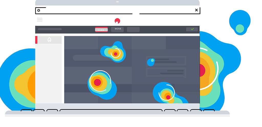
Track Data: Another way is by using measurement tools such as Hotjar or Google Analytics, which can track heatmaps and drop-off rates. Use this to measure pages or steps that might seem tasking.
Highlight Features: You could also highlight premium features during onboarding (e.g., Zoom’s upsell to paid plans after free meetings).
Communicate Clearly: To reduce friction and support tickets while onboarding, add in-app guidance, video instructions, and tooltips to explain what each process entails, copies and language should also communicate clearly what is required of the user.
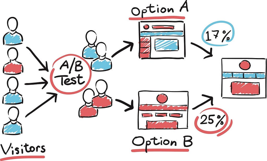
Data-driven decisions: I think the most important thing we can implement is to have Data-driven iterations such as A/B test flows (e.g., LinkedIn’s profile-completion nudges increased engagement by 25%).
Business Impact:
- Example: Siemens redesigned onboarding for its internal app, slashing IT tickets by 50% (≈$500k/year saved) and achieving 90% adoption.
- ROI: For $1 invested in onboarding UX, companies see 5-$10 in retention/revenue gains (McKinsey).
3 Actionable Steps to Help Curb Losses
- Map onboarding to revenue/cost metrics: Calculate the cost of churn (e.g., losing 100 users/month at $50/user = 50/user = $60k/year).
- Prioritize high-impact UI/UX fixes: Use heatmaps to identify drop-off points (e.g., if 40% leave at registration → add SSO). Fixing just 1–2 friction points can recover 15–20% of lost revenue (Userpilot).
- Quantify success with business metrics: It's not just about having your users come on it's keeping them on in the long run that's why it's really important to track post-onboarding outcomes. Such as the Lifetime value of users who completed the onboarding
Pitfalls to Avoid
- Designing in a vacuum: UI/UX teams must collaborate with finance/ops to align on business priorities.
- Ignoring post-onboarding: 60% of churn happens after onboarding (AppsFlyer). Use nudges (e.g., “Haven’t tried X feature yet?”).
- Over-engineering: Fancy animations or excessive steps → 20% drop-off per extra click (Baymard).
In conclusion
Poor onboarding isn’t just a UX problem; it’s also a financial drain. When we treat interface, experience, and business as a 3-legged stool that needs each other to work, companies can Reduce costs, Boost revenue, and Retain users.
Don’t forget to leave a clap 👏 you can also reach out to me on X [Formely Twitter] or Linkedin
Your Onboarding Might be Killing your Business was originally published in Bootcamp on Medium, where people are continuing the conversation by highlighting and responding to this story.
Originally published on Medium ↗