Vibing Code: Building a real budgeting app with AI
One interesting thing about “vibe coding” is that people think a founder types build me an app into a chat window, and a beautiful demo appears twenty seconds later, and the article ends there. While part of that might be true, definitely not the 220-second part Claude would be fathoming and contemplating for about 10 mins first
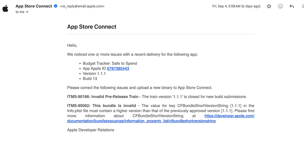
Yesterday at 09:29 I got this email from Apple:
ITMS-90186: Invalid Pre-Release Train — The train version '1.1.1' is closed for new build submissions.
The build was fine and the .ipa was signed, uploaded, and processed. It just couldn't go anywhere, because Apple had already accepted a build under version 1.1.1, and their release "train" for that version was now closed to new arrivals.
Between having a demo and publishing live on the store lies a small mountain of these emails, bugs, limit reaching, hallucinations, and if you ever read a story that skips them, it's skipping the actual work.
I built a Budget Tracker app that’s live on iOS and currently in Beta for the Play Store (If you’re interested in testing, please drop a comment), and here’s what shipping with an AI from my experience actually looks like.
The Idea
Budget Tracker is a personal budgeting app; the whole app lives on your device. The main question it exists to answer is the first thing you see at the top of the home screen, which is “how much is safe to spend today?.
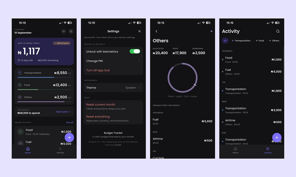
While doing some information gathering or research on the technology behind the application, I found that it was built by Claude Code in React Native with Expo. I am not a full-time software engineer. I run a small design studio called Break and Build, and Budget Tracker is the first thing we’ve shipped to the App Store.
What Shipping Looks Like
One really interesting thing about building is that what works on my simulator and what is shipped on the App Store takes hours of balancing and software changes, prompting,g and research
To get things live: an Apple Developer account; provisioning profiles and signing certificates; a bundleIdentifier that has to match the App Store Connect record exactly (learned the hard way); an NSFaceIDUsageDescription, because Apple rejects apps that touch Face ID without one; an app icon in the format iOS 18 wants (a .icon folder, not a.png); privacy manifests; encryption declarations; screenshots at the exact pixel dimensions; a support URL that actually resolves; and, critically, a version-number strategy nobody warns you about.
Here’s the version-number bit, because it matters. Apple keeps two versions per build. What users see, like "1.1.,0— is called the train. CFBundleVersion The build number, like "12," is one carriage on that train.
Once you submit any build under a given train, the train closes. No new build numbers can join it. You have to bump the train version for the next submission. If you don't, you get ITMS-90186.
I think this is becoming too serious,s so just look at the diagram below for the gist lol:
1.0.0 → rejected (train closed)1.1.0 → accepted TestFlight1.1.0 → rejected (train closed again)1.1.1 → accepted1.1.1 → rejected (you get it)1.1.2 → accepted — typing this from that versionThe AI knew exactly what the error meant every time, and if I am being honest, it should have anticipated it, considering it happened multiple times. That’s the trade: it’s a very fast collaborator who occasionally forgets a couple of things,ngs and you’d have to bring it back to memory, so it's quite vital that you do your own checks and balances and not trust the entire build to the AI.
Features Land, Testers Talk Back
Nothing gives anxiety like having people test your app, but it's also such an amazing learning curve seeing different perspectives you didn’t explore before.
The most valuable feedback of the whole build came from two places at once. Real testers surfacing things I’d missed: first, a form field that wouldn’t let them edit the day-of-month for recurring bills; and the reminders feature they hadn’t realised existed. And me, using the app on my own phone, I found myself screenshotting the Settings screen back to Claude with three notes:
- the switch should be green when it’s on, not white
- “Unlock with Face ID / Touch ID” wraps onto two lines
- Appearance can be a dropdown, not those tabs; but that’s not ideal
Fifteen minutes later I had a Switch component overridden to use iOS-native green (#34C759) when on; the label rewritten to "Unlock with biometrics", and less confusing on a device that has both Face ID and Touch ID; and the three-tab Appearance segment replaced with a row that opens a bottom sheet matching the pattern the app already used for Currency.
The interesting bit is that none of these three fixes required a design decision I hadn’t already made. The token for iOS-native green already existed. The row-plus-bottom-sheet pattern already lived elsewhere in the app. The fixes just required someone to actually use the thing and notice we hadn’t held to our own decisions.
The AI closes the gap between decision and code. It doesn’t close the gap between how the thing should feel and how the thing feels in your hand.
No amount of prompting closes that gap; using the app closes it.
The Boring Bits
A couple of days later, I encountered some problems that had happened on my end that I had not seen on any AI Coding article:
- A keystore leaked in build logs. An EAS local Android build printed the base64-encoded signing key into the terminal transcript. If that key gets committed or pasted anywhere public, anyone can sign updates that Google Play will accept as me. I noticed within a minute and deleted the transcript. The AI’s response, appropriately, was: stop what you’re doing, delete the log, rotate if in doubt.
- A DNS blip cancelled a TestFlight submission. After a build finished, the auto-submit call died with getaddrinfo ENOTFOUND api.expo.dev. The build was fine; my DNS was fine again by the time I noticed, but the submission had exited non-zero and needed a manual retry.
- An auto-generated config polluted the repo root. Because I fired off a build from the wrong folder, the build tool thought it was starting a fresh project from scratch, wrote a blank template config into the top of my repo, and exited with an error. If I hadn’t caught it, the next save could have shipped that empty template as real config. Cleaned up, re-ran from the right folder, moved on.
None of these are AI failures. They’re just the shape of shipping software. The AI helped with all three but only because I was in the loop noticing them. If you’re not checking these things, the AI ships broken things for you.
Designing With, Not For
The last piece I shipped, and the one I’m proudest of, was a redesign of the home screen worked out entirely in dialogue with the AI.
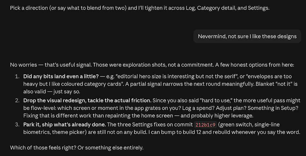
For the first attempt, I asked for “a visual polish pass” with no other specifics. Claude gave me four directions on a shared design canvas. I looked at them and don't like them. It didn’t argue; it also didn’t roll out four more variants and hope one landed. It asked me two questions:
Which app’s home screen do you envy? — Copilot Money · Apple Wallet · Monarch Money · Apple Fitness
What does “better” mean here? — Reads as more premium · Easier to scan in 2 seconds · Categories feel more tangible · Cleaner, less visual noise
I picked Copilot Money and easier to scan in 2 seconds. That direction gave me three lines of feedback, and a rewrite ofHomeScreen.tsx, a new HomeCategoryRow component, and added a paceStatus selector.
It’s the kind of thing I’d have hand-waved into “I’ll figure it out later” if I’d been coding alone. With Claude, I described the behaviour I wanted — “a mood indicator, not an accountant” — and got a selector that implemented that behaviour faithfully.
Design in conversation, at its best, is a fast partner doing the mechanical labour and a slow partner (me) doing the taste labour. Neither could have done this piece of work alone.
What I’d Tell You
- The cost of a demo is not the cost of a product. The demo is 20% of the calendar. Store submission, review, signing, testing, feedback loops, the third time you patch a button colour-that’s the other 80%.
- Testers first, features second. The most valuable feedback came from real people using the app on their phones with real transactions. Ship early and listen to feedback; this would help you patch fast.
- Ask the AI for options with trade-offs. The best moments of this build came from Claude saying “here are two directions; here’s what each is best for.” Not “here’s what you should do.” You keep taste-authority; the AI takes cognitive-cost authority.
- Ship in tiny slices. The three Settings fixes were their own commit and their own build. The home redesign was its own commit and its own build. When something breaks in TestFlight tomorrow, I can bisect in minutes, not hours.
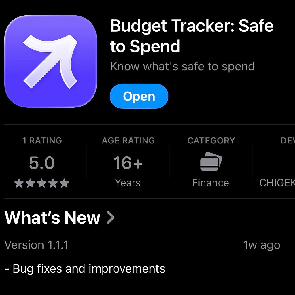
Budget Tracker v1.1.2 is on the App Store, and Google Play closed testing as I type this.
Courage Egbude runs Break and Build in Nigeria. Budget Tracker is one of the Apps we currently have rolled out on Apple and Google Playstore.
If you need help with your next website or app build-up, get in touch.
Originally published on Medium ↗