Earlier this year while exploring TikTok (yes I use TikTok), I stumbled upon a video from Mustafa Kurtuldu, and It was so mind opening, that I quickly rushed over to his YouTube to watch the full talk he gave.
He spoke about designing for speed and I’d base this article on a couple of interesting things he said, but my main focus would be on Loading Screens. I’d also advise everyone to have a look at that talk, I have attached the link Here and would drop other reference links at the end of this article.
Its not Good UX or Speed. Good user experience allows customers to use your products faster two of them can and should coexist
While he spoke about designing for speed he also emphasized that you do not need to forfeit good UX for faster products, also referencing real-life scenarios, as we try to create products that work faster we shouldn’t get to a point where we optimize our designs and the experience becomes bad.
A lot of the time while approaching problems, we tend to look at them from the wrong lens which could eventually end up causing more problems, In cases like this User research helps to reframe the problem.
By making the site 1 second faster we could increase engagement by 5% - Cait O’Riordan — The Financial Times
So how do we go fast? ……….. With the power of family

Just Kidding…
There are various ways we could make products faster but for this article, as I mentioned earlier I’d be focusing on Loading screens.
Loading screens
Loading screens are screens shown while a program loads or is initializing. In design, there are a lot of ways this can be represented, and although there are the basic conventional ones, designers have also come up with enjoyable types of loaders that engage the users.
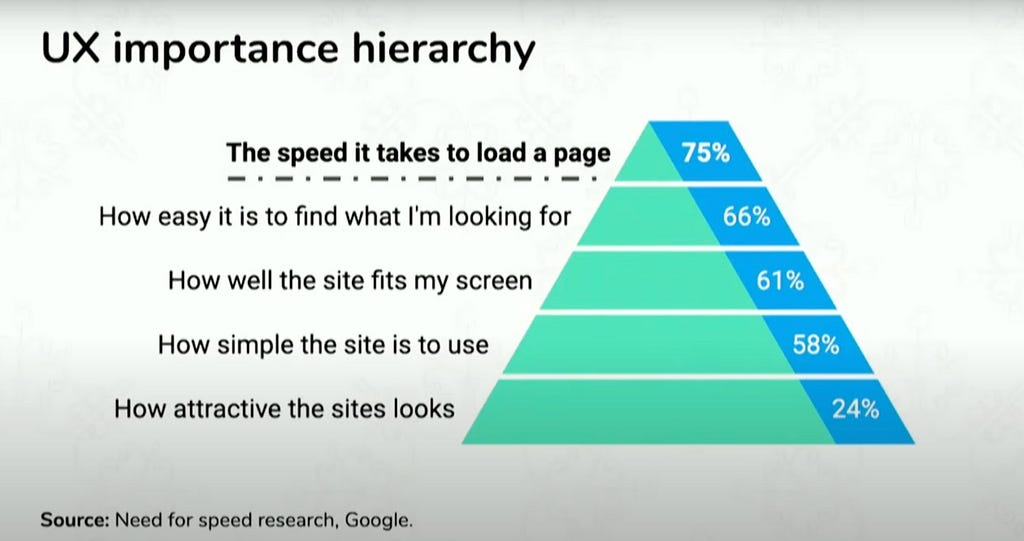
In research conducted by Google, this image shows why fast-loading screens are so important.
Ranking Loading Screens
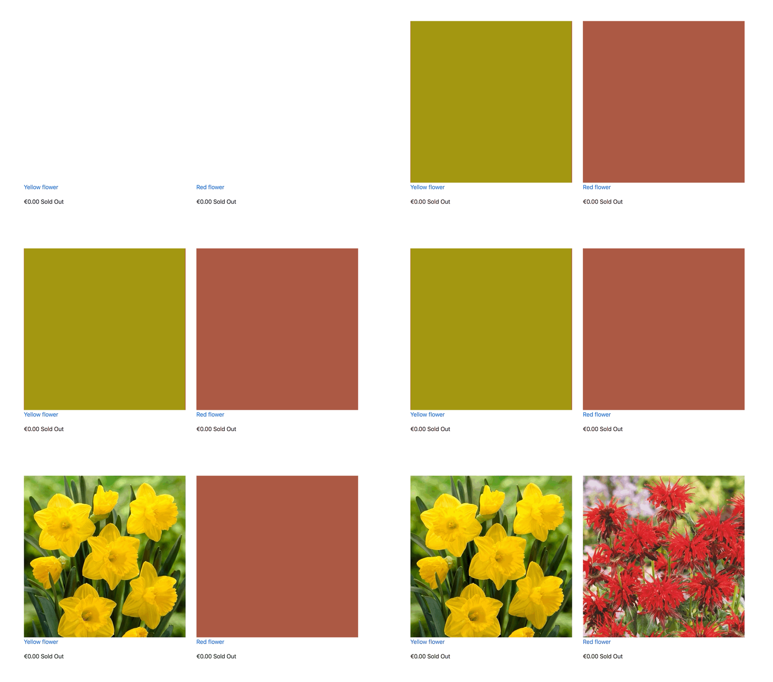
Blank screen [⭐️ 1/5]: I mean, it doesn’t let you know what’s next and could give the user a perception that the site is broken or they haven’t carried out a command.
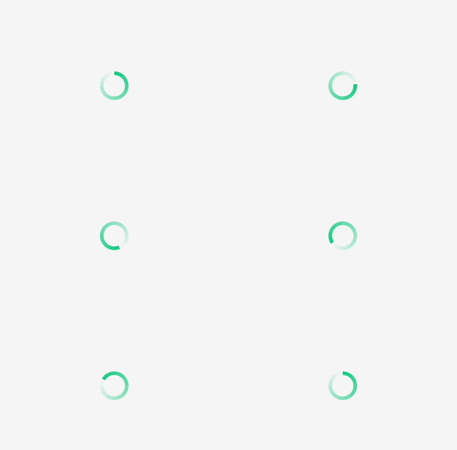
Spinner [⭐️ 2.5/5]: They do not indicate how long something is going to load, and people have negative annotations with spinners. I’d say if you have to make use of this it could be nice to include the percent left or a count down. Micro-animating this properly could also allow users to stay on a while longer.
Skeleton Screens [⭐️ 3.5/5]: These have become a lot more popular, but there have been terrible methods of implementation, where users have to wait to reveal all the content at once.
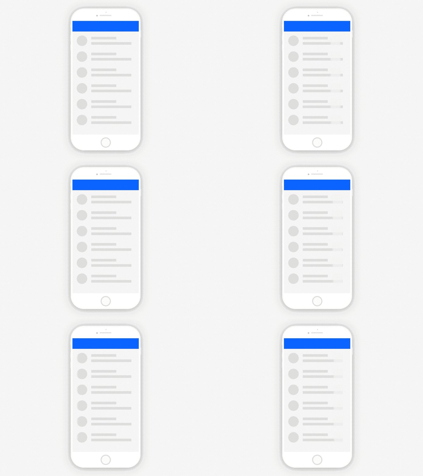
4. Staggered / Lazy Loading[⭐️ 4.5/5]: Similar to the Skeleton screens, this is a better implementation where we load the important things on the page first, while still waiting for other data to come up.
In Conclusion
We should show content as soon as possible and avoid loading blank screens, Although there are a lot of other factors that affect site loading it is important to go through the checks with you and your team to ensure that speed and better user experiences are prioritized.
I’d love to hear what you’re ideal loading screen types are. Don’t forget to leave a clap 👏 you can also reach out to me on Twitter or Linkedin
Originally published on Medium ↗